
Emergency: Adding a Feature to a Web App
COMPANY OVERVIEW
Emergency, fka Emergency Ventures, is a public safety app. Their main mission is to connect and serve citizens, volunteers, and emergency managers in natural disasters. They’re all about helping citizens weather natural disasters by arming them with personalized data to make it relevant and actionable to the individual and their situation.
COMPANY
Emergency Ventures
TEAM
Joe Russo (Stakeholder)
ROLE
UX Designer, Researcher
TIMELINE
4 weeks (March 2022-April 2022 - internship)
TOOLS
Figma, Miro, Trello
MY CONTRIBUTIONS
I spearheaded the design of an evacuation portal for the existing Emergency Ventures Web App. I was the sole designer for this project, responsible for the complete UX design process from UX research to building the final prototype.

Context
THE PROBLEM
In the event of a hurricane striking Florida, how might we provide timely evacuation updates to citizens, enabling them to gain knowledge and make informed decisions with data?
Millions of people in Florida are affected by hurricanes and need to prepare for potential evacuation, but they struggle to do so. Existing disaster-related information is generic, scattered, inaccurate, and not actionable. This makes it difficult for people to quickly evacuate in an emergency.
THE SOLUTION
An evacuation portal to empower Floridians to navigate hurricanes with ease.
I designed an evacuation portal with evacuation and flood zone mapping, an evacuation checklist, evacuation routes based on geolocation, highway traffic incident feedback, and directions to the nearest shelter locations to enable Floridians to make informed choices for their safety.
This portal can help keep people safe by aggregating and personalizing disaster information associated with evacuation intelligence.
KEY FEATURES
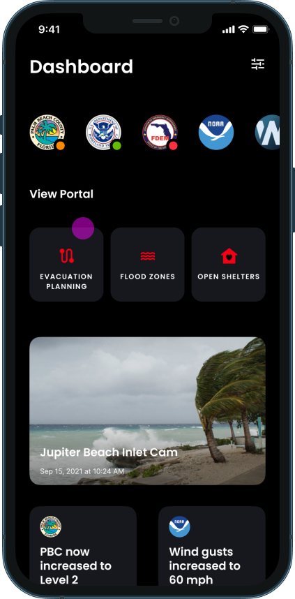
Find everything you need on your Home/Dashboard
You can find your evacuation portal on the home page.
In an emergency, it is critical to have the most important features and functions at the top of the home screen for quick access.
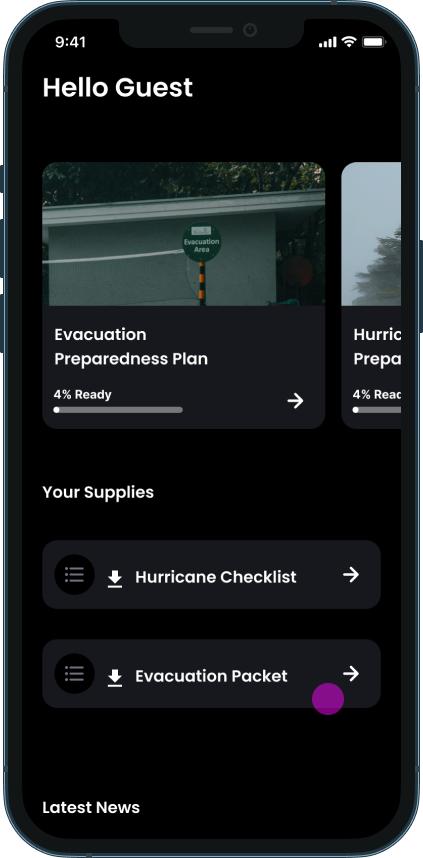
Plan for every scenario
In your evacuation portal, you will find preparedness plans and checklists for critical supplies needed if you need to evacuate.
You can find everything you need in one convenient location on your evacuation planning portal.
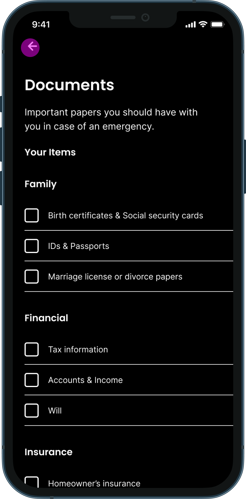
Pack your important documents
An Evacuation Packet/Checklist will ensure you haven’t missed any of the important documents and supplies you need to ensure your evacuation goes smoothly.

Know your evacuation zone
If you enable location tracking, whether you live near the coast or inland, the app will notify you of your evacuation zone.

Get timely and critical notifications in an emergency
Learn about your level of risk and get recommendations on whether or not you should evacuate.

Directions to your nearest shelter location
Find directions to your nearest shelter and approximate time until arrival based on geolocation.

Highway Traffic Incident Feedback
Understand the traffic conditions with highway traffic incident feedback.

Evacuation Routes based on Geolocation
Know what routes will produce the best results for evacuating quickly and safely.
Click on icons in the map for tooltips related to shelter capacity, gas availability, and more relevant evacuation information.
Design Process
User Research
DOUBLE DIAMOND
The "Double Diamond" is a design thinking and problem-solving framework that is commonly used in design and innovation processes. It consists of two distinct phases, each represented by a diamond shape, see below:

BUSINESS GOAL
The stakeholders came to me with the intention of introducing an evacuation portal feature to help Floridians navigate the decisions around emergency evacuation.
With this in mind, I started by conducting market research to understand the problem space and user research targeting users who have experienced hurricanes before to discover their preparedness processes.
RESEARCH METHODS
Finding consolidated information and news on hurricane preparedness was extremely time-consuming and frustrating.
Competitive Analysis - 5 Studies
Government sites like FEMA are difficult to navigate when searching for real-time, actionable next steps. They offer generalized emergency management guides but no personalized resources.
After researching 5 competitors, I discovered the gap in the market of providing evacuation routes and traffic updates.

Survey - 28 Respondents
To understand what keeps people from evacuating, I distributed a survey to those who have experienced hurricanes in their regions.
I found that most respondents have never evacuated before in the event of a hurricane.
The majority of respondents chose to evacuate due to a government order.
43% of respondents would rate the difficulty of locating and understanding emergency data during a hurricane as a 6-10 (1-10 scale with 10 being the most difficult).

Interviews - 5 Participants

With regard to evacuation, I found that people want clear information about evacuation routes, traffic incidents, and congestion.
Synthesis
AFFINITY MAPPING
To consolidate findings, I created an affinity diagram to steer in a specific problem space. I bucketed insights based on sources of information, methods for decision-making, types of information needed, evacuation factors, and feature wants. I also noted pains and gains in users’ digital experience when preparing for evacuation.
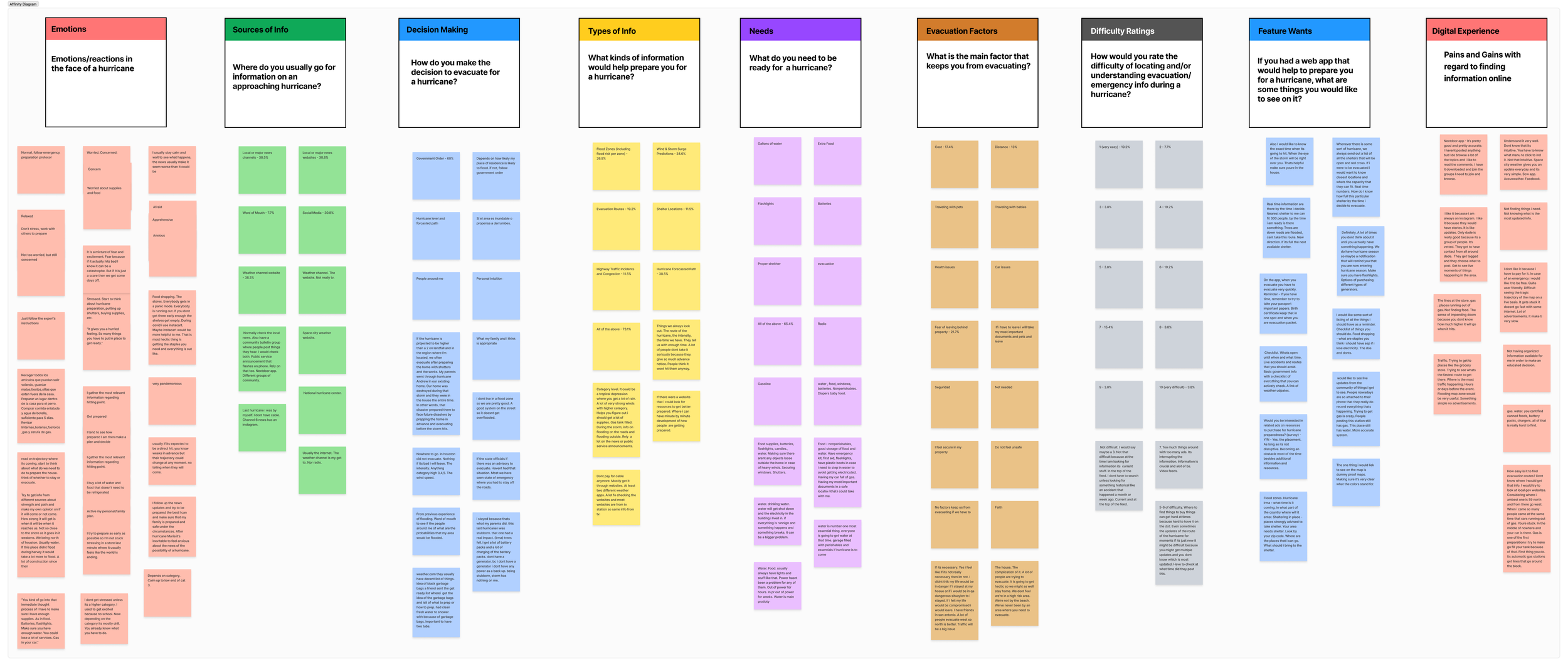
KEY INSIGHTS & PERSONA
I created a user persona to reflect users’ core needs and frustrations regarding getting the information they need to evacuate amid hurricane warnings safely and efficiently.
Users’ core needs are:
knowing their evacuation zone + routes
the level of highway congestion
being able to locate shelter information
Their main frustrations are:
disorganized and inactionable information
locating relevant data on evacuation zones + routes
the traffic conditions at any given time

DESIGN REQUIREMENTS
Our main design challenge was to determine how we might make hurricane-related data points clear for Floridans in our evacuation portal so they can make educated decisions about whether or not to evacuate amid a hurricane.
Ideation
CONSTRAINTS
Adding an evacuation portal using an established design system

The stakeholder previously worked with a designer who provided concepts for key features such as a homepage/dashboard, map layers, and evacuation zone mapping. This is what I used as the basis for future ideation and design work.
CREATIVE BRAINSTORMING

Following a round of rapid ideation, I developed a feature prioritization chart to identify the above opportunity areas, serving as the basis for feature design.
After a discussion with the stakeholder, I focused on providing: an evacuation packet, evacuation routes, highway traffic incidents/congestion, and nearby shelter locations to satisfy users’ core needs.
DESIGN EXPLORATIONS
Before sketching, I created a user flow to provide design direction on the number of screens that would be necessary to provide a solution to users’ needs for evacuation alerts and routes. Through these sketches, I experimented with visualizing the user journey of locating essential information via an evacuation portal during a hurricane warning.

Iteration
MID-FIDELITY
Moving from paper to digital wireframes made it easy to understand how the design could help address user pain points and improve the user experience.
Prioritizing helpful buttons and information locations on the home page was a key part of my strategy.
Based on the user feedback on the sketches, I made the following changes:
Moved the evacuation portal button from the bottom to the top of the home screen
Adding updated shelter information to include capacity updates
Included threat level on evacuation zone descriptions to emphasize severity

USER FEEDBACK
From user testing with 5 users, they felt that if they were actually in danger, the pop-up/modal (screen 3) was really effective. However, they wanted the ability to search for their desired destination. Based on this insight, I added search functionality (last screen).
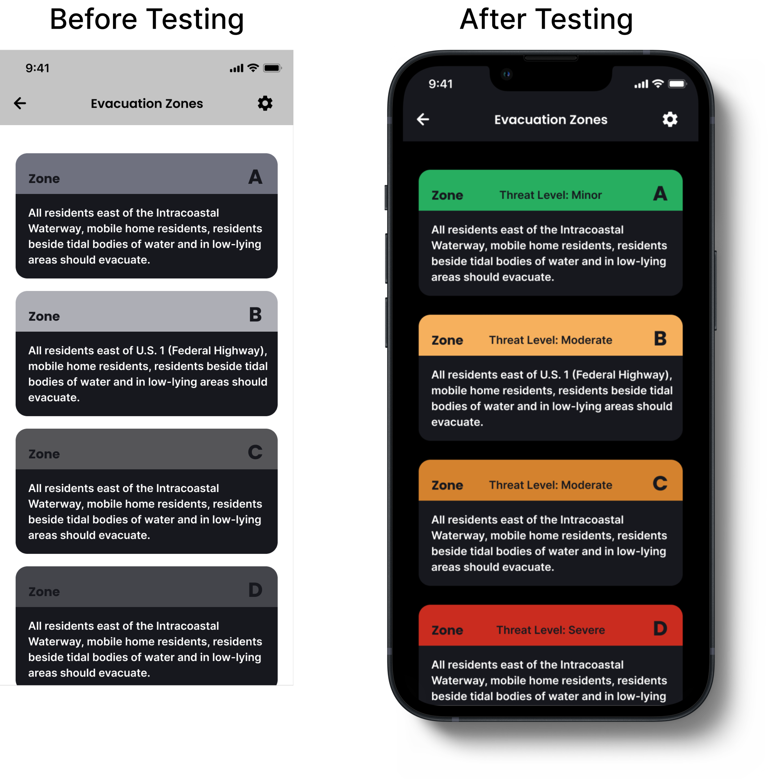
Based on an additional round of user testing, I added threat level indications per evacuation zone.
Thus, after visual design edits and incorporating user testing feedback, I pitched the final designs and next steps with the stakeholder with intention on implementation. He was pleased with the results and provided positive feedback on the final designs.
Delivery


Reflection
LESSONS LEARNED
Being one of my first design challenges, I learned that even small design changes can greatly impact the user experience. I learned about information hierarchy and how the most important features and portals must be at the top of the home screen for quick access. Additionally, it would be useful for users to include relevant data to help them make more informed determinations around evacuation such as the percentage of people in a specific zone who choose to evacuate.
NEXT STEPS
The next steps would be to implement additional features based on user research and conduct further testing after each iteration.